

The Northside brand encompasses every facet that communicates who we are as a church: our values, tradition, mission, and heart. It is how we represent ourselves, and the stronger and more consistent we make our brand, the stronger our promise becomes.
We strive to serve God with excellence and to portray the Kingdom to an unfamiliar audience. In Luke 5:32, Christ says, “I have not come to call the righteous, but sinners.” Will anyone come to Christ because we use the correct logo or remember every comma? Probably not. Instead, members and visitors will see greater validity in our brand, allowing us to better communicate our promise to an unfamiliar audience.
Thank you in advance for your effort in representing Northside well.


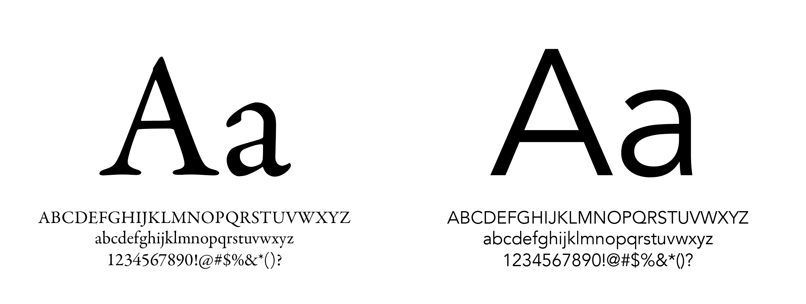 Garamond Premier Pro is our preferred serif font. Avenir is our preferred sans serif font.